B2 Urban
Online sale of sportswear in the Canary Islands
Research, UX/UI Design and E-commerce development in the Wordpress CMS with Woocommerce to boost online sales of the sports fashion brand par excellence in the Canary Islands, B2 Urban.
Client
B2 Urban
Industry
Sportswear
Lenght
4 months
Year
2021
Briefing
What's B2 Urban?
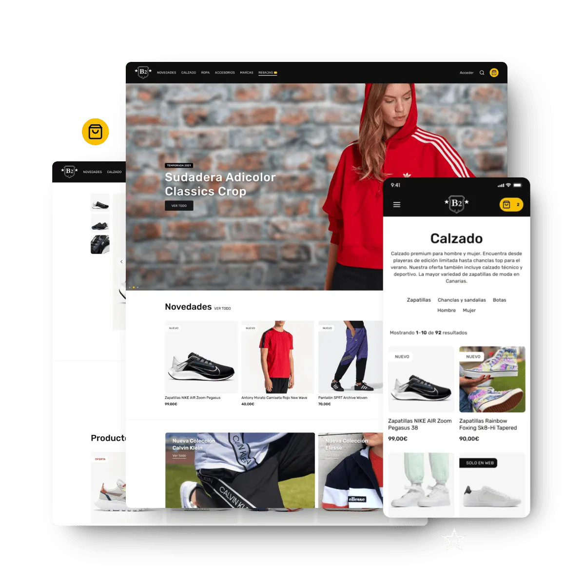
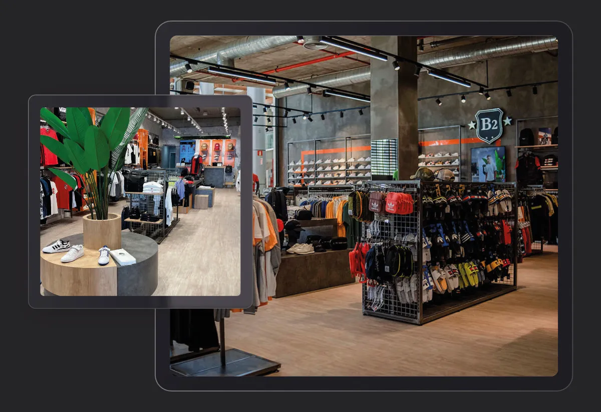
B2 Urban is a sportswear and streetwear store aimed at a young, urban public located in the Canary Islands. The chain of stores offers a wide variety of clothing and footwear from world-renowned brands with a medium-high ticket value, focusing on current styles that fuse comfort and trend. The store is known for its selection of sneakers, sweatshirts, t-shirts and accessories that reflect urban culture, sport and current trends, becoming a point of reference for young people looking for modern and fresh looks. With several locations on the islands of Las Palmas (Gran Canaria, Fuerteventura and Lanzarote), the brand has found a space in the sector for those who want to be up to date with sports fashion.
My responsibility
Scope of work and schedule
The project began thanks to contact with Jorge Rebull, marketing specialist at B2 Urban. Joint work was carried out on research and decision-making. The project was developed from research to publication, and monitoring of the results to iterate on improvements to the platform.
UX Design
Market Research for the project. Identification of the brand's potential customers, their habits and the obstacles to online shopping in the context of online stores in the Canary Islands. Creation of the Scope Canvas.
UI Design
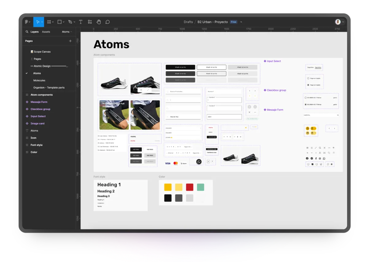
Design of components and screens. Layout of the design in Figma using the Atomic Design methodology, creating atom components with state variants from the beginning to reuse in the template.
Prototype
Design and layout of the initial prototype in Figma so that the client could approve the main definitions and the success flow of the app, user testing and strategy to take the approved design to the development stage.
E-commerce development
E-commerce development, which consisted of creating the template in HTML, CSS, Javascript and the WordPress template system. Oreste Riquenes, backend dev, developed an integration plugin with the ERP.
Project Goals
The need to change the direction of the brand's online sales led us to agree to start the project. In 2021, the brand had an online store that only received between 1 and 5 orders per month, had several navigation and usability problems, as well as problems with payment methods. The main short-medium term objective was to increase conversions by at least 3x and improve the recurrence of current customers. As a long-term objective, it was agreed to look for mechanisms to generate a solid digital relationship with customers through trust and good service.
Project challenges
In addition to the sales problems that existed, the rapid updating of the stock of the online store and physical stores made sales management difficult. One of the challenges was to develop a Woocommerce plugin that would receive a .CSV file every hour with the updatable stock data. Although a direct integration via API was the best alternative, the company's ERP did not offer this possibility.
La solución
Urban fashion e-commerce in the Canary Islands
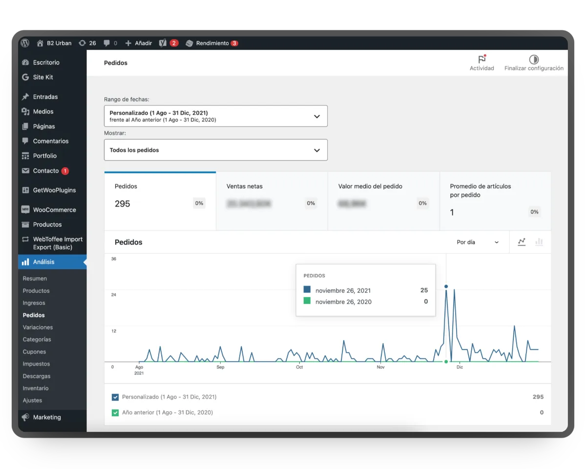
The project's result met all the expectations of the client and the market by far. Since its publication, it has exceeded 100 orders per month and in the first 5 months alone, an ROI of over 200% was achieved.
Design and usability
An ecommerce focused on the user and the product
Clarity and transparency: A design focused on the product, describing it, a complete size guide, showing all its views accompanied by how it looks worn by local young people.
Proximity and support: El ecommerce se centró en tener un equipo disponible para solucionar la dudas de tallas, fecha de envío o recogida en tienda. La confianza y tranquilidad se generaba al tener siempre una persona con la que entablar una conversación.
Customization: Through various techniques, the aim was to personalize the treatment and experience of each user. By automating various repetitive tasks, room was left for personalized attention.
Diseño de pantallas
User flow
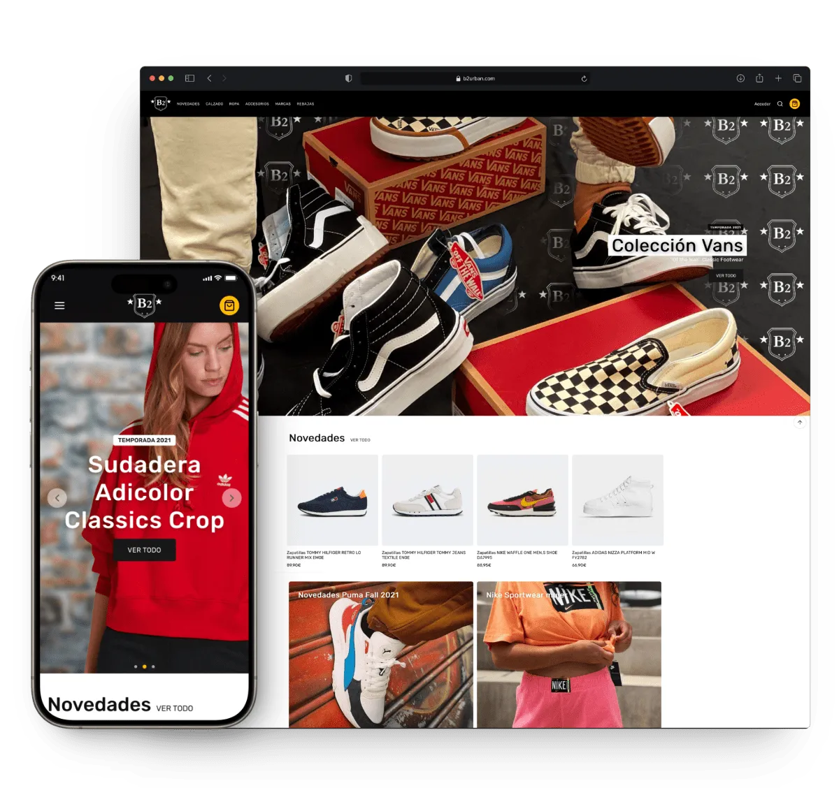
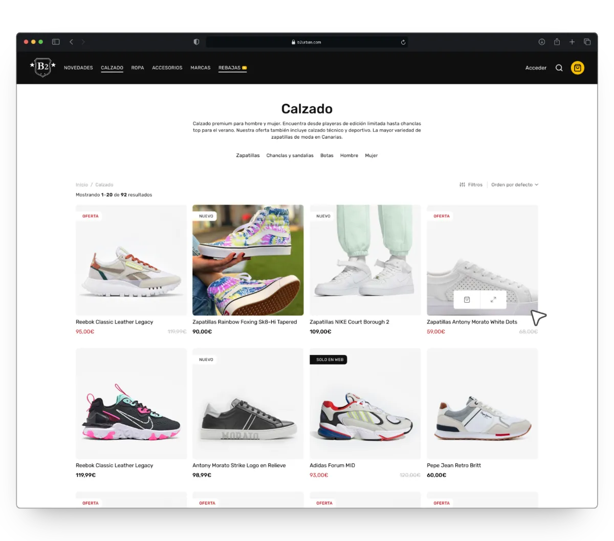
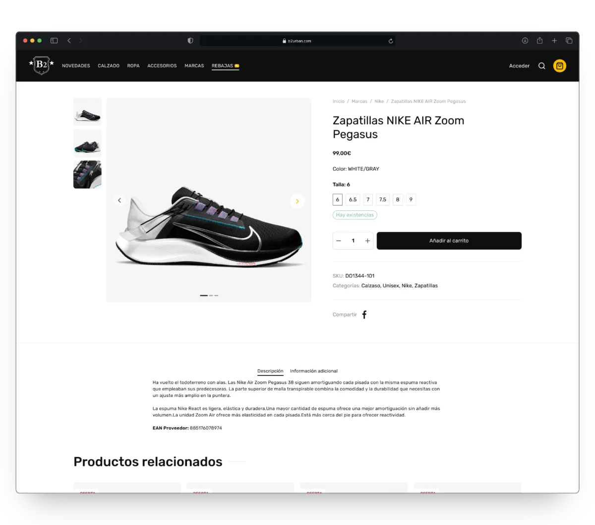
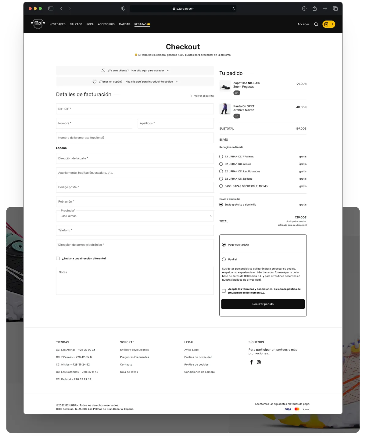
In these screenshots you can see some of the main pages that make up the user's navigation until they complete a purchase. The cleanliness and clarity of the content, the proximity of some images, and defined functions for each component and section managed to reduce the rejection of online purchases in B2 urban.
Figma components
Atomic Design
Preview of some components and their variants for the prototype in Figma
Business Impact
Relevant Metrics
When the new store was launched in conjunction with marketing strategies driven by Jorge Rebul and the Marketing department, the previous store went from having between 1 and 5 orders per month to reaching more than 100 orders per month. An ROI of 238.33% was obtained in just the first 5 months with respect to the initial investment in the creation of the e-commerce.
